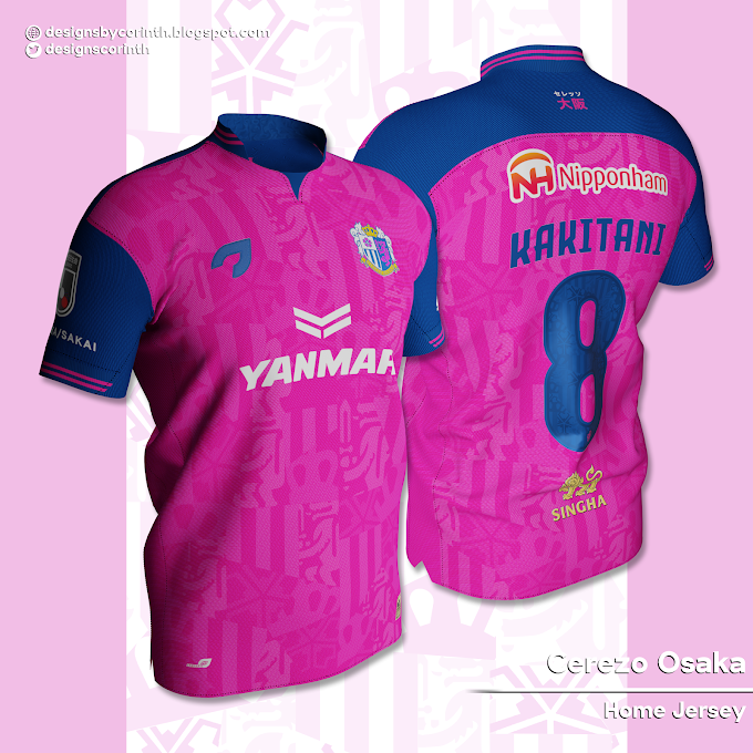
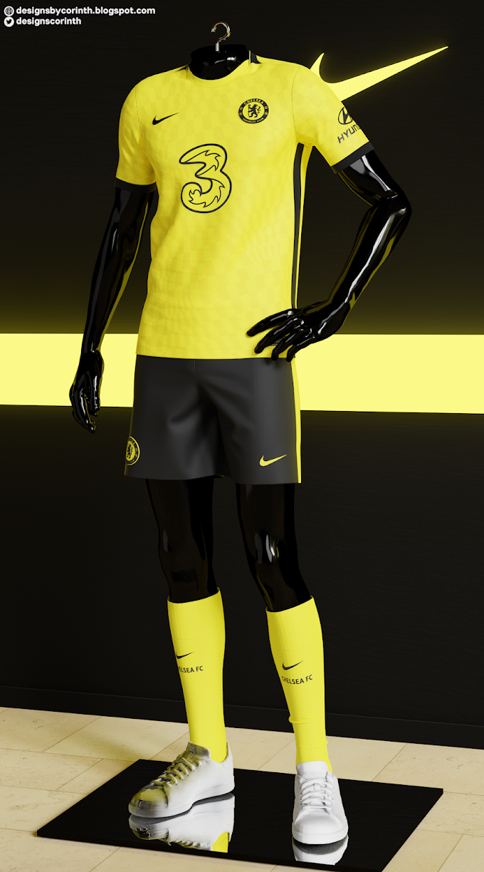
Hello, everyone!
Lately, I've been receiving some questions on how to export designs and render them in Blender, so I decided to create a tutorial on how to do it. I’m not a Blender specialist, so this won’t be an in-depth tutorial on every function of Blender, but instead a basic one more focused on the essentials for rendering your designs in an easy, good-quality way. In the future, I intend to create other tutorials aimed at more specific purposes.
Since I create my kits in Marvelous Designer - which does not support rendering - I had to rely on an external renderer, and Blender was a great option: it's free, yet it creates great renders, it's somewhat easy to use, and, once again, it's free. haha
Even if you use Clo3d, you might want to try Blender, as, given then right configurations, it may create better renders than Clo3d's own renderer. But enough with babbling, let's get going!
1. Exporting your design from Marvelous Designer / Clo3d:
This first step is very straightforward: simply go to File > Export > FBX (or OBJ, if you prefer). After that, choose a name for your file, click on 'save', and an export options screen should appear. I recommend using the settings shown in the image below, but, if you wish, you can set the fabric to thick, instead of thin, and weld, instead of unweld. In most cases, I do not recommend creating multiple objects, as they become annoying to work on Blender.
2. Importing your design to Blender:
Once again, we have a very straightforward step: in Blender, go to File > Import > .FBX (or Wavefront .obj, if you chose that export format). Your kit should be loaded into the scenes with its texture and normals already UV mapped - which is very convenient!
3. Configuring your render properties:
Now the real work begins! To start things off, let's talk about Blender's render properties, which can be found on the bottom-right sidebar (as does most of the stuff we'll tackle from now on).
In the 'Render Engine' setting, you'll notice there are three options: Workbench, Eevee and Cycles. In a very summarized explanation, Workbench is just for testing and shouldn't be used in your final render; Eevee is a more 'basic' engine that does rendering pretty fast, but with less quality; and finally, Cycles is Blender's best engine in terms of quality. Because it's a path tracing engine, it does lighting way way better than the other two engines, creating more realistic images. However, this quality comes with a price: Cycles is way more demanding on your pc, and renders take way longer to finish. It should your standard engine, nonetheless, since the wait really pays off. And if you have a good GPU, make sure to activate 'GPU Compute' on the 'Device' section.
In the render properties tab, you can also find other useful options. In sampling, you can set the number of samples of your render. The higher the number of samples, the more realistic and less noisy the render will be. In my experience, while raising the samples to, i.e., 500, do produce a better result, the added render time isn't worth it. The standard 128 (or maybe 200) works just fine for me. But remember to select, in the 'integrator' section, the option 'Branched Path Tracing', so it can take all lights into account for shading instead of just one.
If you plan to later add a background to your rendered image, don't forget to select the 'Transparent' checkbox, right below the Pixel Filter.
Lastly, in 'Color Management', you can set some properties regarding the image itself. I usually go for 'High contrast', and you can also play with the 'gamma' and 'exposure' options to give more/less brightness and saturation to the render.
Of course, there are many other options to mess around in the render properties, but I think this should be enough to create a good-quality render.
4. Output properties:
There's nothing too complex here. You have options to select the resolution of your image, the file format, etc. Just select a resolution and format you think suits best your design, and you're good to go - just remember that higher resolutions mean longer render times.
5. Camera:
By clicking on 'Camera' on the Scene Collection (top-right sidebar), you are able to control the camera on your scene. You can move it and rotate it manually by selecting one of the two options on the left sidebar and then using the arrows (or circles, for rotating) near the camera; or you can input values on the 'Transform' box to the left of the Scene Collection.
You also have access to the camera properties (again, on the bottom-right sidebar). Here, you have a few options, but the most important is the focal length, which controls the angle of view—how much of the scene will be captured—and the magnification—how large individual elements will be. The longer the focal length, the narrower the angle of view and the higher the magnification. The shorter the focal length, the wider the angle of view and the lower the magnification.
Tip: by clicking Numpad 0, you’ll be able to see your camera view. This is great for making adjustments to the position and rotation of your camera.
6. Lighting:
This is probably one of the most important (if not the most important) aspects of your render. Lighting can make or break a render, so you should pay special attention to it.
There are multiple ways you can set up the lighting to your scene. One method I particularly like is the three-point lighting (https://en.wikipedia.org/wiki/Three-point_lighting), which involves using three light spots in different positions to better controls the shading and shadows casted on the model (thanks to Vitor for the valuable tips on how to properly set up 3PL).
To add a light, simply click on 'Add' on the toolbar near the top-right, then select 'Light' and one the of the four options (usually, 'Spot'). After you create a new light and select it on the Scene Collection, a 'Object Data Properties' tab will appear on the bottom-right sidebar. Here you can control things like the color and power of the light. There's no standard 'recipe' here: you should tweak with those properties until you find a configuration that works well on your kit.
Another option to add lighting to your scene without the use of lights is adding an HDRI, which consist of using images to reproduce luminosity. To do this, you must go to the 'World Properties' tab, then click on color and select 'Environment Texture'. After that click on 'Open' and select you HDRI texture. One great resource for downloading HDRIs is HDRI Haven - you'll find many great HDRIs entirely free of charge there.
7. Material properties:
By selecting you model on the Scene Collection and clicking on the material properties on the bottom-left sidebar, you can control the way different parts of your design look and react to the lighting. When you import you MD/Clo3d model to Blender, each fabric, logo, button, topstitch, etc. will receive its own ‘material’, so you must tweak with the options in each component of the jersey. This may seem annoying at first, but it’s actually quite useful, since the i.e. sponsor logos and the fabric of the shirt should behave differently from each other anyway.
Here are a few important properties:
A – Metallic: as the name suggest, the metallic property increases the metallic aspect of your material. You won’t use it most of the times, but it’s quite useful if you want to create silver/golden logos.
B – IOR: Index of Refraction. It describes how fast light travels through the material. Most types of fabric have a IOR of around 1.5~1.6. I usually use 1.5.
C – Specular: it controls how much (dielectric specular) reflection your material creates. You get a realistic Specular value, you can use the Fresnel formula: ((IOR−1)/(IOR+1))^2/0.08. For a IOR of 1.5, you get a convenient specular value of 0.5.
D – Specular tint: basically, makes the specular lights ‘tinted’ by the base color of your material.
E – Roughness: IMO, the most important property of all. Higher levels of roughness spread lights more evenly, creating a less glossy look. I sometimes add a custom roughness map (by clicking on the circle next to the option and selecting ‘image texture’, or by adding a node on the shading tab - more info on that on Step 8), but for fabric materials, usually a roughness level of 0.7 works fine for me (of course, this can change depending on the type of material).
F – Sheen: amount of soft velvet like reflection near edges, for simulating materials such as cloth. It’s very subtle, but useful anyway. For the fabric materials of your shirt, you should set it to 1.0.
G – Sheen tint: just like specular tint, it mixes the base color of your material to the reflection.
H – Alpha: it’s the transparency of your material. Unless you want something to look transparent, you should leave it at 1.0.
I – Normal: the normal map of your material. If you set a normal map on Marvelous Designer/Clo3d, it should be already there. However, you can use this property to change, add or remove a normal map if you want to.
I guess these are the most important properties for shirt rendering. If you want to learn more about the other properties, a good option is too read the Blender Documentation (https://docs.blender.org/manual/en/latest/render/shader_nodes/shader/principled.html)
8. The shading tab:
The shading tab is by no means something necessary to your render, but it can be quite useful sometimes. It is essentially the same as the material properties, but instead of presenting a list of options, it features nodes, which are easier on the eye, and make it possible to add a few options not available on the material properties (afaik). To add a node, simply press Shift + A, and then select the desired node. Some useful nodes are ‘image texture’ (to add, i.e., a specific roughness map) and ‘mapping’ (to adjust the position, rotation and/or scale of your map).
9. Rendering:
After you’re satisfied with the changes you’ve made to your model, the last step is, of course, to render your design. You can do it by clicking on Render > Render Image on the top toolbar (or simply using the shortcut F12). After a few minutes (or several, depending on your hardware and the properties you’ve used), your rendered image should be ready! Make sure to save it by clicking on Image > Save As (or Shift + Alt + S).
And that’s the end of the tutorial! Like I’ve said, I’m no Blender guru, so I’m sorry for not making a more in-depth tutorial, but I hope this was useful! If you still have any questions, you can contact me via email (designsbycorinth@gmail.com) or Twitter (@DesignsCorinth).


0 Comments